
On January 20, 1992, Air Inter Flight 148 crashed into the Vosges Mountains of France, killing 87 out of the 96 occupants. How did this tragedy come to happen? Poor usability. The Airbus A320 was equipped with the latest digital cockpit displays and instrumentation. Unfortunately, it used a single panel to display two different modes, descent angle and descent rate, and both were represented with two digits. Whereas the captain thought he was approaching the airport at a descent angle of 3.3 degrees (about 800 feet per minute), the plane was in fact approaching at an abnormally high descent rate of 3300 feet per minute.
Usability can be the difference between life and death, profitability and loss. When it comes to industrial control, most engineers create SCADA screens to support PLC code functionality, rather than designing the user interface (UI) with ease of use for the operator first in mind. Consider these four design principles for improving usability and enhancing your operator’s ability to control the plant:
1) Color
Color (and especially contrast) is so powerful because it often communicates before all other visual factors like text are taken into account. By using an intuitive understanding of colors in GUIs, people can draw on past experiences and easily learn a new theme. The key is consistency – choose a few colors and then give them the same meaning across all screens in the software.
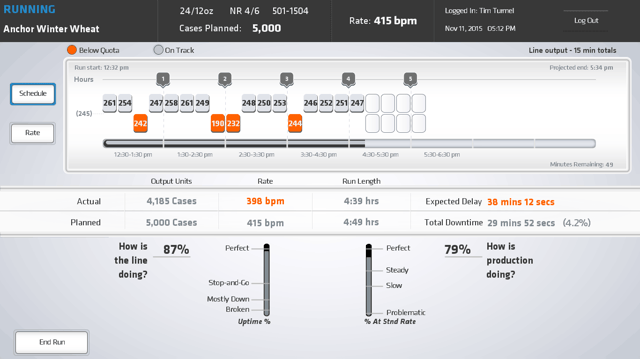
An award-winning project by Vertech using a clean color palette with orange, blue, and gray.
2) Layout
Layout is also hugely important because it gives people a frame of reference for how they should interact with an environment. In stores, the layout of the building guides people to the highly profitable items and keeps the checkout stands near the exits. With software, layout takes what we know about human nature and arranges buttons, diagrams, and other control screen elements in a logical, easily readable manner. In the case of the 1992 Airbus crash, two similar data points were grouped together in a poorly organized layout.
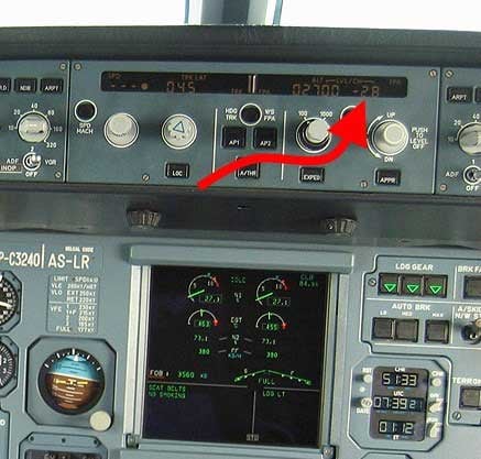
The Airbus A320 cockpit panel that displayed both descent angle and descent rate (Source: Martin Doms)
3) Navigation
Effective software navigation gives users access to critical information quickly and intuitively. Good rules of thumb include keeping the hierarchy consistent and putting the navigation bar in the same location on all screens. Ideally, with a well-designed navigation system, someone without training but familiar with the plant should be able to navigate to any part of the SCADA without heading down dead ends.
4) Typography and Imagery
Remember that a good picture is worth a thousand words, but a bad picture is worth a few choice words. A style guideline should be created to keep a clean and consistent look for any text on the UI. Plus, good use of intuitive icons and shapes can immediately convey information, especially in situations when time may be of the essence.
To learn more about how usability can boost productivity and profitability, read the full whitepaper “7 Essential Components to a SCADA UI That Revolutionize Plant Productivity.”


COMMENTS